Quantcast
Channel: Announcements – Clockwork Design Group, Inc | Web & Print Design in Waltham & Boston MA
Viewing all 29 articles
Browse latest View live

Clockwork Helps with LMA New England Regional Conference Design

$
0
0

For the Legal Marketing Association New England’s (LMA NE) Regional Conference (with the theme of “Law Firms of the Future”), Clockwork designed a logo, created print and online ads, web and email banners, and a Save the Date postcard.

Logo


Web Banner


Online Ad


Print Ad


Save the Date Postcard


Clockwork Helps LSSO with New RainDance Conference Design

$
0
0

For the Legal Sales and Service Organization’s (LSSO) 2017 RainDance Conference, Clockwork designed a new logo treatment and Save The Date postcard.

Logo Design


Save The Date postcard

2016 Holiday Wishes from Clockwork

Announcing a New Website for Tighe & Bond

$
0
0

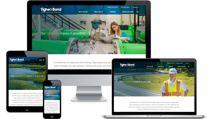
The recently launched Tighe & Bond website is vibrant and professional, just like the firm. Tighe & Bond is recognized as one of the best civil engineering firms to work for in the nation by the Zweig Group.

The homepage slider uses fluid (full-width) photos, many of which feature actual employees at work in the office or in the field. Clockwork directed the photo shoot to capture a library of images that are used throughout the site. The brand messaging, “Our creativity makes it possible. Our experience makes it practical.” is complemented by the concise yet engaging text immediately below.

The advanced search tool lets users filter results by category. Further down the homepage, there is a dynamic pull of the three latest news posts. The project spotlight and employee spotlights are randomly drawn from the database. A row of graphic icons each link to the respective main service page. At the footer of every page, we list office locations, links to top tweets, and encourage visitors to join the firm’s email list.

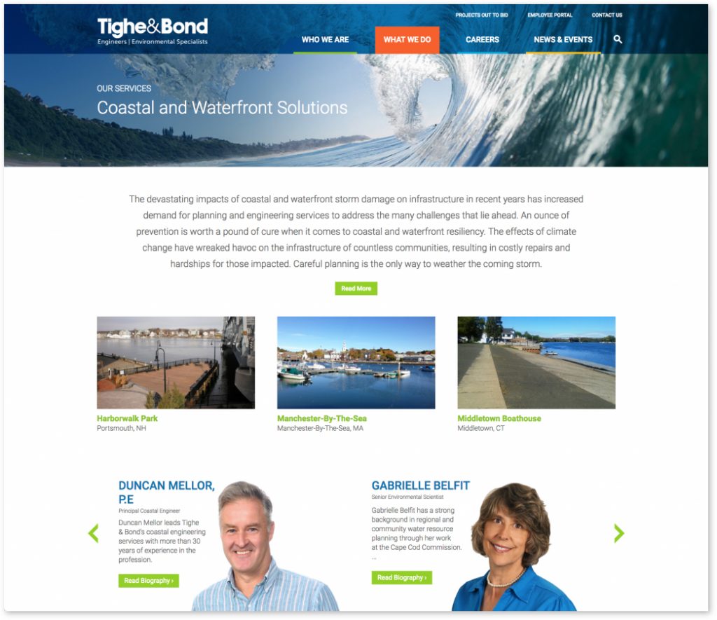
Rather than having a separate portfolio section, we guide visitors to projects based on their interests. Under the main “What We Do” tab, users can sort by Markets or Services. On each of these pages, related projects and employees are featured, encouraging visitors to click to keep exploring.

Similarly, every individual project page not only offers information about the project but shows thumbnail links to related projects as well as a photo slider linking to project leaders’ bios.

Throughout the site, we encourage visitors to interact. On many pages, we include a “Let’s Talk” quick form in the right sidebar, to make it easy for users to request someone contact them, and the firm to capture contact information.

Tighe & Bond puts its people first, as the Our People section of the website reflects. Visitors can search by keyword or filter by service or market. Each bio page includes a personal quotation in addition to easy links to email, phone, etc. In the Careers section, a photo slider at the bottom of most pages links to testimonials of current employees. The Current Opportunities tab links to the firm’s external recruiting software that is styled to maintain a consistent look and feel.

The News & Events section allows users to easily sort and filter the firm’s robust content. Tighe & Bond offers regular classes to engineers and others in the industry. The Conference Center section lets visitors learn about, register and pay for upcoming regulatory seminars and training.

As Tighe & Bond’s President & CEO, Dave Pinsky, stated: “Committed to being trusted advisors who provide tailored solutions, we wanted our new website to reflect this same philosophy. So, we set about designing our website with a focus on the benefit to our clients and website visitors. We also wanted to bring elements of our core business into greater focus and create a fresh design and easier to navigate website.”

We are delighted to have helped Tighe & Bond meet their website goals!

We’ll be at LMA Nationals! Will You?

$
0
0

Vanessa and I are looking forward to attending the Legal Marketing Association (LMA) Annual Conference in Las Vegas March 27th-29th. Please come by our booth (#200), say hello, and ask us questions. We are always excited to talk about new branding and design trends and best practices in legal marketing.

Not sure who to look for? This is us!

Just a reminder: Don’t forget to bring your business cards to the conference! Someone always forgets. 😉

Ligris Website Wins National Award

$
0
0

We are thrilled to be recognized by the Legal Marketing Association’s 2017 Your Honor Awards for the website we created for our client Ligris! We received second place for the competitive, national website award category.


Ligris + Associates PC is a young, innovative law firm that’s very progressive when it comes to marketing their firm. The result is a website that reflects the firm’s innovative attitude. The design is modern, hip without being trendy, and truly on-brand. Though the firm is a boutique, the site looks big, bold and forward-thinking. The new site has helped build brand awareness, grow the firm’s headcount and bring in new business.

The main goals of the new website were to:

  • Establish a visual brand that does not look like a “typical” law firm website, differentiate the firm and immediately present a modern, energetic, vibrant and fun style.
  • Engage visitors with messaging that is reflective of the firm’s style: quick, to the point, clever and witty.
  • Build a technologically innovative site, responsive for easy mobile viewing, with a contact form as well as client intake forms to leverage the website for paperless communications.
  • Encourage exploration throughout the site with obvious cross-links and related content on every page.
  • Personalize the attorney bio pages by including personal photos and fun facts.
  • Leverage the new design standards across all marketing collateral to create a unified brand to build awareness of the firm.

Since launch, the Ligris website has shown impressive results:

  • Page views to the Attorney listing page increased over 200 percent; from approximately 350 views in the month before the new site launch to over 1,000 views in one month a year after launch.
  • Important for their business, Ligris needed to target visitors to a contact form with prominent calls-to-action throughout the site. The old website had no contact form of any kind. Now, page views of the contact form are typically 100-200 views per month.
  • The firm’s Facebook page now has over 700 likes (impressive for a firm of only 26 attorneys) and social referrals have increased by over 57 percent across the firm’s Facebook, LinkedIn, and Twitter pages. Along with the social referrals, direct search sessions increased over 19 percent, organic search increased over 10 percent and the total referral sessions increased over 8.5 percent.
  • The website has helped with recruiting objectives. The firm has grown by over 8 percent since the site launch in mid-May.

Visit the site at ligris.com!

Clockwork Celebrates 22 Years!

$
0
0

How better to celebrate our anniversary on a hot summer day than with a walk across the street for some delicious Gelato!


ClockworkAnniversary22th


A Bold New Look for Modrall Sperling

$
0
0

Modrall Sperling is the counsel of choice for complex business, litigation and natural resources challenges anywhere in New Mexico. The firm works with clients in industries including Construction, Education, Energy, Finance, Healthcare, Manufacturing, Mining, Railroads, Ranching, Real Estate, as well as businesses working in Indian Country, and more. The new website positions Modrall Sperling as the go-to law firm in New Mexico.

The redesigned homepage is vibrant, modern, and focused on the firm’s core strengths. Each of the main slider photos showcases a significant case story. The catchy headline links to the full story, and supports the new brand messaging: “Complexity is Our Comfort Zone.” The positioning statement continues: “Modrall Sperling is the go-to law firm in New Mexico. Facing a business and regulatory landscape as diverse as the region itself, our clients value our deep roots and experience across the state and beyond. From family legacy and corporate growth to litigation and Native American Law, we have New Mexico covered.”

Site Features:

  • Responsive design for ease of use on all devices.
  • Clean, modern navigation, including a sticky footer on tablet and smartphone screen sizes to help users quickly jump to the sections that interest them the most.
  • Robust content and crosslinking between related pages.
  • Tabs on main interior pages (such as bios and practices) so viewers can quickly and easily access important information, without being overloaded.
  • Key contacts on practice areas to help potential new clients determine who to reach out to for more information.
  • Crosslinks to encourage site visitors to keep reading and exploring.
  • A blog to publish the firm’s frequent thought leadership and news.
  • Dynamically generated PDFs of all the bio, practice, industry, and case story pages.
  • A photo gallery for the firm’s art collection.

Explore the site at modrall.com.


Announcing a Fresh New Brand for Peabody & Arnold

$
0
0

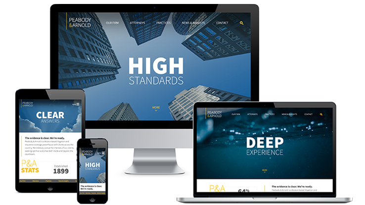
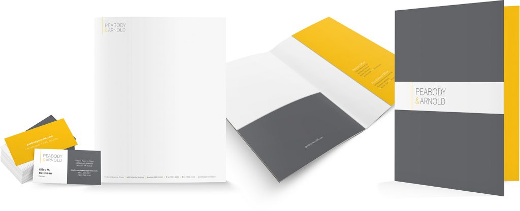
Peabody & Arnold is proud to be one of the oldest law firms in Boston, but the firm realized that their dated website and marketing materials were making the firm seem old-fashioned. We helped create a fresh new brand for the firm that aligns with their modern business approach, broadens their reach, and emphasizes and showcases their strengths as a litigation and insurance coverage powerhouse.

Website

The new homepage is bold, modern, and targeted. The messaging highlights what clients value most from the firm: “High Standards. Clear Answers. Deep Experience.” The homepage also emphasizes the firm’s impressive credentials with rotating statistics paired with the headline, “The evidence is clear. We’re ready.”

Site Features:

Visit the site at peabodyarnold.com.


Logo

The logo was completely modernized using a clean, sans-serif font, a gray and yellow palette, and a vertical rule that consistently anchors the logo to the top of the page.


Print & Digital Collateral

The gray and yellow color palette carries through all marketing materials including pocket folders, stationery, PowerPoint template, LinkedIn company page, email marketing template, and more.

Viewing all 29 articles
Browse latest View live


Latest Images