Quantcast
Channel: Announcements – Clockwork Design Group, Inc | Web & Print Design in Waltham & Boston MA
Viewing all 29 articles
Browse latest View live

Redesigned, Repositioned & Responsive

$
0
0

laptopsCongratulations to our clients, Hobbs Brook Management and Anderson & Kreiger, on the launch of their new websites! Both sites were built using responsive design, so that all content on all pages is easy to view and access from phone, tablet, laptop and desktop screen sizes.


Since 1952, Hobbs Brook Management has been a pioneer in the development of premier office space in the Boston suburbs. Their legacy is built on trusted relationships with their tenants. We redesigned their website to improve the useability for the tenants who visit the site, and added the human element to reflect Hobbs Brook’s high-touch service.

The homepage has a “fluid” design, so the main photo area always fills the viewer’s browser window. The animation rotates between Hobbs Brook properties and portraits of employees/valued partners, reinforcing the tagline: “The most valuable thing we develop isn’t a building, it’s a relationship.”


Anderson & Kreiger LLP is a vibrant, growing law firm committed to making the legal experience personal again. Their style is open, friendly and practical. Our redesign included the new logo and tagline: “What Brings Us Together Sets Us Apart.” The homepage design features case studies of the high stakes litigation, complex transactions, public interest, and other interesting work the attorneys handle.

The new website incorporates two blogs into the main website using WordPress Multisite functionality. All content can now be administered from the centralized CMS. The site is built out to support multiple blogs and to allow more blogs to be added in the future.


Vanessa at LMA New England’s Annual Conference

$
0
0

VatLMANE

Vanessa led a panel session today at the LMA New England Annual Conference on streamlining the rebranding and website process. A big thanks to Eugenia Huh, Jennifer Irvine, and Lisa Murray for sharing their insights and war stories.

Join Vanessa this Thursday for the SMPS Building Leaders Series Event

$
0
0

Vanessa will be one of the speakers at SMPS’ Building Leaders Series, “Branding Strategy: Tips from the Experts”

In this interactive panel discussion hear from industry experts on branding, brand strategy, and how to approach a rebrand. Get tips on how to begin a rebrand in-house or work with an outside consultant.

Read more at the SMPS Boston website.

2014 Holiday Wishes from Clockwork

Recent Renovation: Branding & Marketing for Farley White’s Commercial Real Estate Properties in Lowell

$
0
0


Farley-White


Farley White Interests is now the largest commercial real estate property owner in the city of Lowell. Their properties include three commercial office buildings as well as a self-storage facility. Farley White enlisted the help of Clockwork to market their properties to brokers and prospective tenants, positioning Lowell as a smart investment and desirable location for office space.

Clockwork designed a family of pieces that work together as a consistent, branded package. We began by developing property names and URLs for each location. Then, we developed logos, brochures, and websites, as well as a flexible email marketing template the firm can use to promote their properties to brokers and communicate with tenants.

Once the four names were approved, we created a set of illustrative, circular logos. The established color of each logo carries through to the respective brochure and website.

Offices-at-Boott-Mills The logo for the Offices at Boott Mills alludes to the history of the cotton mill by using a magnified “weaving” theme. We chose a bright olive green for this palette color, as it works well with the brick structure and time period of the architecture.
Cross-River-Center The Cross River Center logo incorporates modern, abstract lines and shapes that suggest movement and water flowing. We chose a brighter blue color for this logo to stay with the water theme and have a “techie” flare.
Wannalancit-Mills We modified the existing Wannalancit Mills logo emphasizing the building’s tower, and chose a rich red for this palette color to complement the location’s warm red brick tones.
Boot-Mills-Storage For Boott Mills Storage we created a simple graphic of an open box and selected a bright orange color that will be highly visible on signage.

farley-white-brosNext, we created very attractive and informative brochures for each of the three office properties. The property brochures use eye-catching photography and concise copy to showcase the space, amenities, and unique selling points for each building and the city of Lowell. The tri-panel brochure layout accommodates floor plan inserts in the center pocket.

farley-white-websitesThe fully responsive websites feature a modern, scrolling page layout and include two rotating picture sliders, downloadable floor plan PDFs, a prominent map and contact form. Secondary page content includes information for tenants on dining, fitness, and conference center (as available at each location). The Boott Mills Storage site layout is slightly modified to include storage rental inquiry fields in the contact form. We custom designed and built all four sites using WordPress Multisite which allows Farley White to easily manage all content on a network-wide basis. The custom-designed “theme” can be modified to add other property websites as Farley White acquires more properties in its Lowell portfolio.

Client Spotlight: Edelstein & Company

$
0
0

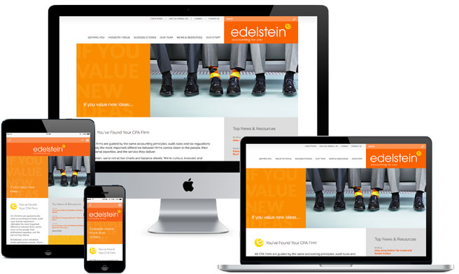
Congratulations to our client, Edelstein & Company, on their successful new brand and website launch! The full rebranding made a big splash with a New Year’s themed animated announcement.

edelstein-ecard

When we started working with Edelstein, we quickly discovered that they are not your typical CPA firm. Clients are drawn to the firm for their friendly, fun, can-do attitude as much as they are for the expertise and business savvy Edelstein accountants provide. Clockwork repositioned the firm’s brand to emphasize and align with their true personality.

Print

We modernized the logo and added a lively, lighthearted, tilted “e” icon as well as a client-focused tagline, “accounting for you”.

edelstein-web

The new website design and copy represents and reinforces the firm’s friendly and personable approach to their work. The design incorporates a warm, cheerful color palette, happy, relaxed portrait photography, and responsive design for easy mobile viewing.

edelstein-print

The color blocking design scheme featured on the website carries through to other marketing materials including business cards, pocket folders, report covers, ad template, PowerPoint template, social media page designs, email marketing template, and more.

Edelstein’s new brand is bold, memorable, and most importantly, authentic.

Clockwork Among Top Web Design & Development Firms in Boston at Clutch

$
0
0

clutch_web_designers_boston_2015We’re happy to hear that Clutch, a company that provides research & reviews on top business-to-business service firms, announced that Clockwork is among the leaders in the Top Web Design & Development Firms in Boston category.

Many thanks to our clients who took part in interviews with the analysts at Clutch! You can see exactly what our clients had to say by visiting our review page, or take a look at the press release regarding the results of the Clutch research.

Anderson & Kreiger Wins an LMA New England Your Honor Award!

$
0
0
LMA-NE-YHA-2014

Danielle, Vanessa, and Bonnie from Clockwork with Eugenia Huh from Anderson & Kreiger

On Wednesday evening we attended the Oscars of Legal Marketing: the LMA New England Your Honor Awards. Clockwork worked with Anderson & Kreiger to design and develop their award-winning new firm website!

The Anderson & Kreiger website is modern, fully responsive for phone and tablet viewing, and uniquely branded to the firm. The logo is clean and fresh, with a distinctive color palette. The tagline, “What Brings Us Together Sets Us Apart” is reinforced throughout the site via messaging and visuals. The homepage slider features significant case stories, each highlighting a key practice area. Clever headlines paired with large black and white photos “pop” off the blue/green background to catch the viewers’ eye and entice them to click.

Congratulations to all our clients and friends on their excellent work over the past year!


Learn from the Experts

$
0
0

SMPS_Noreasters_LMANEJoin us on Wednesday, May 13th, at 5:30 pm when the Boston chapter of Society for Marketing Professional Services, the New England chapters of Legal Marketing Association, and Association of Proposal Management Professionals present a unique and uncharted look at professional services from the lens of three different industries.

A panel of marketing executives will discuss the trends, challenges and opportunities each industry faces. They will share best practices for retaining current clients, growing market share and staying ahead of the curve in today’s competitive and ever-changing environment.

There will be networking opportunities immediately before and after the program. Admission includes passed hors d’oeuvres and an open bar.

Click here to read more and to register.

Hobbs Brook Website is a Winner at SMPS Boston Awards Gala

$
0
0

hobbs-brook-web

We are thrilled to announce that Clockwork came in second place for our joint entry with Rhino PR for the Hobbs Brook Management website (www.hobbsbrook.com) at the SMPS Boston Awards Gala.

The new website achieved all of Hobbs Brook’s marketing objectives and surpassed their expectations in ROI.

Marketing Objectives

  • Raise visibility of Hobbs Brook Management.
  • Increase engagement and web traffic.
  • Create a visually appealing, modern website that is easy to navigate and reflective of the Hobbs Brook brand.
  • Appeal to a dual audience of existing tenants as well as prospective tenants.
  • Build a responsive mobile-friendly website that is easy to use and navigate on all devices.

ROI

(Measured between the first month and seventh month after site launch)

  • 100% increase in website traffic.
  • 290% increase in visits to the property pages.
  • Dining menus were visited 13,000 times over the month of March.
  • 915% increase in page visits to the property management page.

Please visit the site at www.hobbsbrook.com.

Thanks to everyone at Hobbs Brook Management and Rhino PR for such a fun and successful project!

Watch Vanessa’s Interview on Radio Entrepreneurs!

$
0
0

Radio Entrepreneurs shares the stories of entrepreneurs in the interest of giving more exposure to innovative and fast moving companies while creating a knowledge pool for the enrichment of the entrepreneurial community around the world.

The show is broadcast daily and the people featured are entrepreneurs from various backgrounds, telling the story of who they are and how they became an entrepreneur.

Do you, or someone at your firm, have an interesting story to tell on radio Entrepreneurs? Let Vanessa know, and she will make an introduction!

Visit the site at: http://radioentrepreneurs.com/

AP&S Site Launch

$
0
0

aps-web-launch

Adler Pollock & Sheehan (AP&S) is a New England law firm that represents local, national and international clients in a wide range of complex legal matters. AP&S enlisted Clockwork’s assistance to update and enhance their website’s appearance, structure, and usability. The firm also wanted the website to emphasize their track record of success and portray their professional personality.

The homepage features powerful client case studies that demonstrate the firm’s breadth and depth of experience in complex legal matters. The custom photographed, full-width pictures in the background feature attorneys and clients. The leading questions are posed from the clients’ perspective and highlight how clients rely on AP&S to think strategically and guide them in the boardroom, courtroom, and the halls of government. The answers link to the full case story outlining the challenges, solution, results, related practice areas, and attorneys involved.

AP&S-Bio

The attorney bio and practice area pages are designed in a “microsite style,” with tabs so viewers can quickly and easily access important information, without being overloaded. The right sidebar features cross-links to related information to keep readers engaged and exploring the website.

AP&S-Practice-Area

The News Section is built as a blog, but allows visitors to quickly find what they are looking for by clicking the tabs to sort by post type (Events, News, Publications) or by using the search. AP&S also has two practice-specific blogs, which appear within the main site.

AP&S-Blogs

The main site and practice area blogs are built on WordPress Multisite, so that the sites can be administered on a network-wide and individual basis.

See the new, responsive AP&S website at apslaw.com.

RIW’s Refreshed and Responsive Website

$
0
0

riw-web-launch

We recently launched a new, refreshed website for the law firm Ruberto Israel & Weiner (RIW). We created the previous iteration of the firm’s website in early 2008, so it was well due for an update. Core elements of the firm’s branding, such as the powerful tagline “at the speed of YES,” have been maintained on the new site, while new, modern design elements and functionalities have been added to keep up with the latest technology.

Since many of RIW’s clients are highly tech-savvy, it was very important that the refreshed site be modern, well designed, accessible on all devices, easy to navigate, and programmed using current website best practices. The new RIW site is built on the WordPress CMS with responsive design.

riw-bio

The attorney bios, practice areas, and industries are built in a “microsite” style, with tabs to organize more robust content. There are also crosslinks between the related bios, practices, industries, and news posts to encourage visitors to continue exploring the site. The news section has been reorganized in a blog format, for easier searching and sorting of content.

Feel free to explore the site yourself at RIW.com.

Join Us at the LMA New England Conference 2015

2015 Holiday Wishes from Clockwork


Three Wins at This Year’s LMA New England Your Honor Awards!

$
0
0

trophy-winner

We were thrilled to celebrate three award-winning projects with our clients and friends at the Legal Marketing Association of New England’s Your Honor Awards on Wednesday.


1st Place – Website 

The judges were impressed with the site’s improved analytics since launch, and prominent focus on case studies that showcase the firm’s experience in an engaging and unique way. The case studies are featured on the homepage and link to the full stories. Each story includes a custom photo of AP&S attorneys with clients and a headline in the form of a leading question, from the client’s perspective.

APS-CDGI-LMA

Vanessa Schaefer (left) and Danielle Diforio (right) with Toni Bianco, Marketing Manager, and Bob Brooks, Managing Partner, of Adler Pollock & Sheehan


Honorable Mention – Website

The judges commented on the bright, modern design featuring the firm’s tagline “At the speed of YES” and the impressive post-launch site analytics.

riw-web-yha

RIW-CDGI-LMA

Danielle (left) and Vanessa (right) with Mary DesBois, Marketing Coordinator, and Howie Altholtz, CMO of Ruberto Israel & Weiner


1st Place – Promotional Materials/Holiday Card

The judges appreciated the creative combination of a Thanksgiving holiday card with the firm’s 35th anniversary into a playful and memorable animated card.

Congratulations to our clients and all the other winners!

posternak-ecard-yha


Clockwork Design Group Named a Top Boston Digital Agency by Clutch

$
0
0

trophy-winner

Clockwork Design Group, Inc. was recently named a top digital agency in Boston by Clutch, a B2B ratings and reviews firm based in Washington, D.C. Clutch uses a unique methodology to evaluate companies in the marketplace, taking into account proven ability to deliver, focus on digital marketing services, and most importantly, client satisfaction.

We are proud to place high on the list of featured companies that made it onto Clutch’s “Leaders Matrix,” which can largely be attributed to the multiple, glowing interviews with our clients. When asked about their experience working with Clockwork Design Group, Inc. one of our customers stated:

“We’ve loved working with Clockwork. We look at them as an extension of our company. They really spent the time to understand us – what we stand for and what our goals are. They tailored their ideas to our graphic design, templates, and website. Their skills are just amazing. They have great capabilities, particularly in graphics and Web design. Working with Clockwork has been amazing.”

Clockwork Design Group, Inc. is excited to be recognized as a creative leader in the growing Boston market and beyond. We hope to continue collecting 5-star reviews and hearing positive things from our clients like the below:

“They are outstanding – just super. They hit the ball out of the park. They captured the essence of the firm better than I ever expected or anticipated anyone could, then translated that into an excellent design and the key messaging and positioning of the firm.”

Be sure to visit our full profile to read all of our reviews and check out Clutch to learn more about how we were evaluated.

Project Spotlight: A Legal Quartet

$
0
0

Project-Spotlight

A quartet of new law firm projects, that is! No singing attorneys will be found on this blog post.


ligris-website-blog

Ligris & Associates
A complete overhaul of the firm’s brand began with the redesign of the website and logo. The new site features bright colors and bold messaging. Design elements showcase the personality of the firm and attorneys, including individual photo galleries – inspired by social media – at the bottom of attorney bio pages. The full brand rollout included colorful new stationery, pocket folder, mini-brochure, and email marketing templates.


rackemann-website-blog

Rackemann, Sawyer & Brewster
After an initial brand analysis phase, Clockwork crafted homepage messaging that realigns Rackemann’s brand promise with their clients’ brand perceptions. The new positioning emphasizes the firm’s ability to “Find a Way,” providing practical guidance for complex problems. The combination of bright, abstract graphics and black and white portraits makes the new website feel modern as well as sophisticated.


fleischman-law-brochure-blog

Fleischman Law Firm
The elegant firm overview brochure serves as a top-level introduction of Fleischman’s capabilities and services. The stunning NYC cityscape photos used on the firm’s website translate well to this print brochure and ensure consistent branding. We designed the brochure with a pocket on the inside-back cover to house attorney bios or other insert sheets. Website text was edited and streamlined to engage potential clients.


rich_may_mailer-blog

Rich May
Rich May’s boutique Investment Management Group needed to make investment advisors aware of the services the attorneys provide. Rather than sending a formal business letter, we created an accordion-fold mailer that grabs attention with a benefit-centric concept, “Is bigger really better?” As the mailer unfolds, the stretch limo gets longer and longer… humorously reflecting fees charged by bigger firms.

If you are interested in seeing some of our other law firm projects, please visit our portfolio.

Clockwork Launches Two New Websites!

$
0
0

project-rocket-launch

We are proud to announce that we recently launched all new, responsive websites for our clients AGH and Walker.

agh-website

AGH is a leading accounting and business advisory firm based in Atlanta, Georgia. The new website homepage features friendly and inviting professional photography of AGH employees. The messaging is client experience-focused. The splash of orange in the blue color palette makes the site feel warm and modern.

The new site is designed and built to be easy to navigate on all devices. On almost all interior pages of the site, eye-catching photography encourages visitors to click on related client stories, related news, and related experts, keeping users engaged and exploring the site.

walker-website

Walker Parking Consultants specializes in planning, design and restoration of parking facilities worldwide, with 16 offices nationally and two internationally. The new Walker site is clean, modern, and engaging. The homepage slider features fluid (full-width) photos. Each photo pairs with a descriptive phrase and links to an associated expertise page. Further down the homepage there is a dynamic pull of the 3 latest news posts, a careers focused call-to-action, and rotating noteworthy graphic stats about the firm.

Rather than having a separate projects section, we guide visitors to projects based on how they navigate the site. Related projects are featured on every expertise and client-type page, encouraging visitors to click through.

The News section follows a modern blog format with categories, authors, tags, subscription, and search. The News landing page uses a grid layout with an image for every post as well as a prominent fluid, featured photo for the latest post at the top of the page.

The Open Positions in the Careers section integrates with the firm’s Newton applicant tracking software and is styled to maintain a consistent look and feel.

Thanks and congratulations to both our clients!

Clockwork Helps with AAM’s Annual National Conference Design

$
0
0

For the Association for Accounting Marketing’s (AAM) annual national Summit, Clockwork designed a logo, brochure, on-site guide, signage, a PowerPoint template, online ads, app graphics, and more.

Logo


Brochure


On-Site Guide


Signage


PowerPoint Template


Banner Ad


App Splash Screen

Viewing all 29 articles
Browse latest View live


Latest Images